Bitcoin’s latest move higher was triggered by one key catalyst: the temporary Middle East ceasefire.
The easing of geopolitical risk and pressure on energy markets quickly improved sentiment, pushing BTC out of weeks of indecision within the $64,000–$72,000 range into a more accelerated move higher toward the top of the range. As highlighted in the latest Alpha, once price moved above $68,000, negative gamma mechanics flipped, forcing dealers to buy as price rises and accelerating the move higher.
But moves like this can be driven by positioning reacting to price, rather than sustained demand building underneath. This is where professional traders look deeper: Is this a real breakout, or just a short squeeze?
That’s exactly what Chaikin Money Flow (CMF) is designed to reveal.
Welcome to another episode of the Chart Decoder Series, where we uncover the indicators professional traders use to master the chart and your trading universe.
Chaikin Money Flow (CMF) is a volume-based indicator developed by Marc Chaikin, one of the early pioneers in applying money flow analysis to financial markets. It measures whether money is flowing into or out of an asset over a given period, typically 20 or 21 candles.
It builds on the same concept as Accumulation/Distribution but compresses it into a shorter timeframe, giving a clearer view of recent market behaviour.
The idea is simple:
CMF oscillates around zero.
Unlike oscillators like Relative Strength Index (RSI) or Money Flow Index (MFI), CMF doesn’t tell you if something is overbought.
It tells you something more important: Is there real participation behind this move?
In earlier Chart Decoder episodes, we covered Accumulation/Distribution (A/D) and Money Flow Index (MFI). Chaikin Money Flow (CMF) is the missing piece that sits right between them. CMF may look similar to MFI and A/D at first glance. All three rise when the market looks bullish. But they are not the same:
This is where the 0 line on CMF matters:
You can have
This means the move is happening but net capital flow is still negative. More money is still leaving than entering. The rally is built on momentum, not capital. This is often where fake rallies lose strength.
Let’s look at BTC/USD on the 1-hour chart on April 9th, 2026:
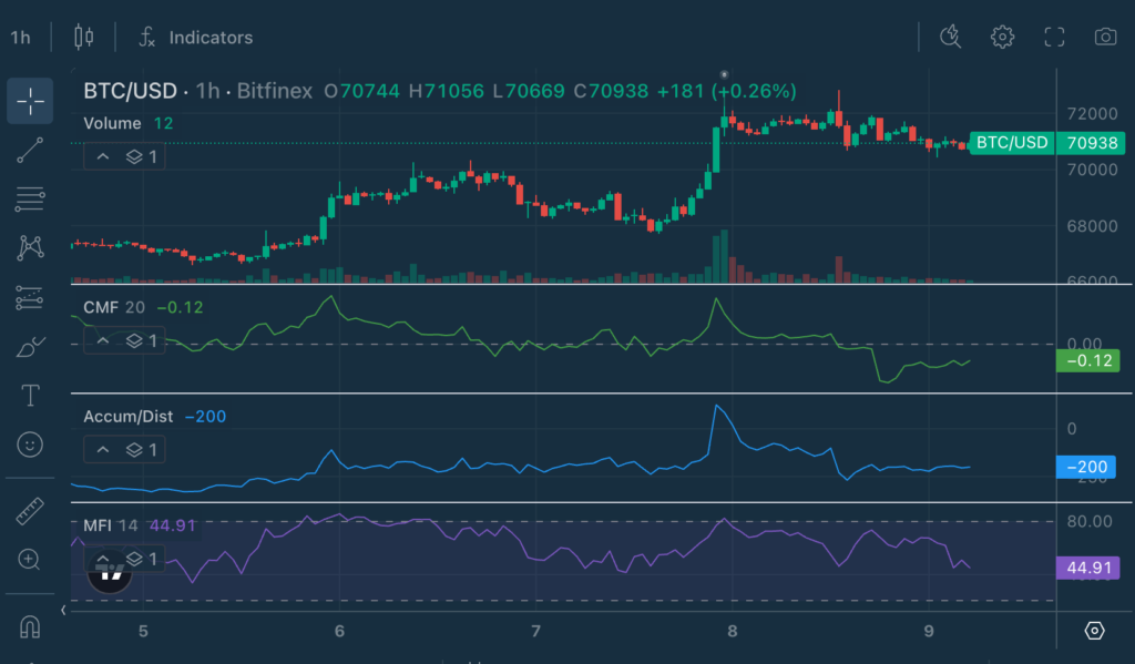
Price has pushed higher but is now consolidating near the highs, showing signs of slowing momentum after the sharp move up.
MFI tells you short-term momentum has cooled. A/D shows that while there was a strong burst of accumulation during the breakout, it is now stabilising. CMF dipping slightly negative is the key shift.
This means, while price is holding firm near the highs, inflows are not actively expanding. Buyers are still present, but not pushing aggressively higher. This is typical behaviour after a sharp move: the market pauses, resets, and waits for the next push rather than continuing in a straight line.
Let’s zoom out to the 4-hour chart to understand the bigger picture behind this move.
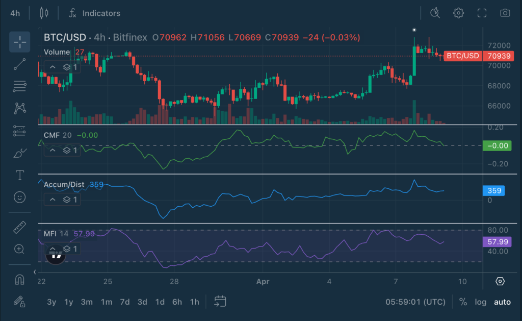
Price has pushed higher and is now holding near the top of the range. But unlike the strong initial breakout, the 4-hour view shows momentum beginning to level off.
CMF has faded back to neutral after being positive, suggesting inflows are no longer strengthening. Money is no longer aggressively entering the market.
A/D remains elevated from the breakout, but has started to flatten, indicating that while accumulation did occur, it is no longer building at the same pace.
Meanwhile, MFI sits in the mid-to-high range, showing some buying pressure, but not strong enough to signal a sustained expansion.
This is a classic post-breakout structure: The move has already happened. Momentum is cooling. The market is now deciding whether to continue higher or consolidate.
Short-term momentum has cooled, with both timeframes pointing to consolidation rather than a reversal.
CMF becomes significantly more powerful when used alongside the tools you already know.
CMF + RSI
RSI identifies stretched conditions. CMF confirms whether money supports the move.
CMF + VWAP
VWAP shows where the price should be. CMF shows whether institutions agree.
CMF + A/D
A/D shows long-term accumulation. CMF shows whether it’s still happening right now.
CMF + Moving Averages
Trend + capital flow alignment creates high-probability setups
When both align, the signal becomes much stronger.
Treating CMF as a standalone signal
Always combine with structure, levels, and trends.
Ignoring divergences
CMF often weakens before price does. Pay attention early.
Using it in low-volume markets
CMF relies on volume. Weak volume means weaker signals.
Forgetting timeframe context
A strong CMF on a 1-hour chart may mean very little on the daily.
Explore the full Chart Decoder library:
The post Chart Decoder Series: Chaikin Money Flow – The Net Capital Inflow Indicator appeared first on Bitfinex blog.