BTC pushed above $79K, breaking out of a two-month range and printing its highest levels since early February. The move didn’t come out of nowhere. Positioning had been building for weeks with institutional demand building through ETF inflows and large players consistently absorbing supply. As price broke higher fuelled by easing geopolitical tension, short positioning was caught offside, accelerating the move through a short squeeze.
While most traders chase momentum and hope for continuation, professional traders ask: Where does volume actually sit?
This is because the price never moves randomly. It gravitates toward the levels where the most trading has happened, and moves fast through empty zones where almost nothing traded.
That’s the edge the Volume Profile chart on Bitfinex gives you, and why professional traders use it to master their trading universe.
Volume Profile is a charting tool that maps how much volume was traded at each price level over a selected period, not across time, but across price.
The standard volume bars at the bottom of your chart show you how much was traded per candle. Volume Profile rotates that view 90 degrees and distributes the total traded volume across the price axis as horizontal bars. The wider the bar at a given price level, the more volume transacted there.
Each bar is split into two colours.
Four levels define every Volume Profile:
Volume Profile helps you see:
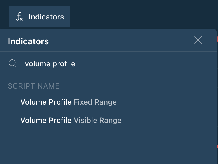
Bitfinex’s TradingView-powered charts give you direct access to the Volume Profile built into the Indicators menu. Search “volume profile” and you’ll see two profile options: Volume Profile Fixed Range and Volume Profile Visible Range.
For this guide, we’re focusing on Volume Profile Visible Range (VPVR).
Here’s what makes it different: instead of analyzing a manually selected range of candles, VPVR automatically recalculates based on whatever portion of the chart is currently visible on your screen. Pan left, zoom in, zoom out, the profile updates in real time to reflect exactly what you’re looking at.
You’re not locked into a static snapshot. As you adjust your view to explore different timeframes or price zones, the POC, Value Area, Value Area High, and Value Area Low all shift to reflect the volume structure of that specific window, giving you context that’s always relevant to where price is right now.
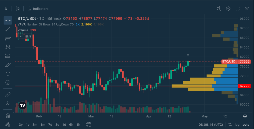
Let’s look at BTC/USD on the 1-hour chart with VPVR loaded up on April 23, 2026:
Price pushed up to a high of $79,471 before pulling back and is now consolidating around $77,800–$78,000, showing signs of slowing momentum after the sharp breakout.
Volume Profile shows that the market has built value around $75–76K, not at the current highs. The strong HVN and POC below indicate established support, while the thin volume above highlights a lack of structural resistance.
This means that while price is holding near the highs, it is doing so above its accepted value. If buyers step in and defend this area, price can move quickly through the low-volume zone and extend higher. If momentum fades, the next key level to watch is the nearest value area around $75–76K, where prior trading activity has been concentrated.
With Volume Profile Visible Range, you can zoom into the specific area of the chart you want to analyse. Let’s focus on BTC/USD on the 1-hour chart, zooming into the rally that began on April 22, 2026:
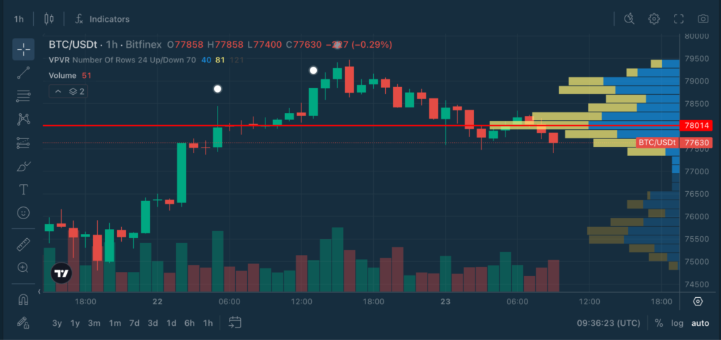
Price has pulled back from the highs (~$79K) and is now consolidating around $77.5–78K, showing a loss of short-term momentum after the breakout.
Now, as you zoom in, notice how the Volume Profile automatically recalculates based on what’s visible on your screen.
By zooming in, you’re no longer looking at the entire move. You’re looking at where the market is trading right now. The market has started to build short-term value higher, closer to $78K. The previous value area (~$75–76K) still exists, but it’s no longer the immediate reference. Price is now interacting with a new, developing value zone.
Price is starting to build activity around the $78K region, suggesting early signs of short-term acceptance. However, this remains a developing area, with the broader value still sitting lower.

On the 4-hour chart:
Volume Profile on the 4-hour timeframe shows that the market’s accepted value is still concentrated in the mid-$70K region, not at the highs. The HVN and POC below represent a strong base of support, while the thinner volume above highlights a lack of established resistance, but also a lack of confirmed acceptance.
This means that while price has successfully broken out, it is still trading above value rather than within it. If buyers continue to support the price at these elevated levels, the market may begin to build new value higher. If not, price may rotate back toward the $74–75K region, where the majority of trading activity has taken place.
When viewed together with the 1-hour chart, we can see that the price has moved higher, but the majority of trading activity is still concentrated below. Until volume builds at these levels, the market is testing higher prices rather than establishing them as value.
1. POC as Support/Resistance
After a breakout, the POC is the first level to defend on any pullback. Price holding above the POC = buyers in control. Price losing the POC = momentum at risk.
2. Value Area Acceptance vs. Rejection
A sustained close above the Value Area High (VAH), market accepting higher prices, bullish expansion likely. A rejection at the VAH, market not ready to move higher, rotation back toward POC expected.
3. Low Volume Node Acceleration
When price breaks through an LVN, expect fast, sustained movement until it finds the next HVN or POC. This is where stop runs happen. Account for it in your risk management.
4. Developing POC Shift
In real-time (using a Developing Volume Profile), watch for the POC to shift as new volume builds. A POC migrating higher during a rally = accumulation occurring at elevated prices = structural strength.
Volume Profile is most powerful when used as the structural foundation that other indicators are read against.
Treating every POC as equally important
Not all POCs are created equal. A POC built over a single 1-hour session carries far less weight than one built across days or weeks of volume. Always check the timeframe and duration of the profile before acting on a level.
Ignoring the Value Area context
The POC alone doesn’t tell the full story. Understanding whether price is inside or outside the Value Area and where the Value Area High, and Value Area Low sit is what gives the POC its context. A POC test means something very different depending on which side of the VAH you’re on.
Using it in low-volume, illiquid conditions
Volume Profile requires meaningful volume to produce reliable levels. In low-liquidity conditions or on very short timeframes, the profile can be distorted and the levels unreliable. Always validate against the broader structure.

Explore the full Chart Decoder library:
The post Chart Decoder Series: Volume Profile – Where the Market Actually Trades appeared first on Bitfinex blog.