
Forex supply and demand zones are price areas that form when order flow imbalance produces a sharp directional move. When buy orders heavily outweigh sell orders, or the reverse, price leaves the area quickly. The imbalance itself defines the zone, not the price level it sits at.
Traders use these zones to frame structure, reactions, and context across different market conditions. Rather than treating levels as static lines, the approach looks at behaviour and participation around key areas.
This article examines how supply and demand zones are identified, how common patterns form, and how they are applied in trading analysis.
Supply and demand zones are price areas where institutional buying or selling has previously entered the market with enough volume to cause a strong move. Traders use these zones to identify potential reversal points, continuation setups, and high-probability entry areas.
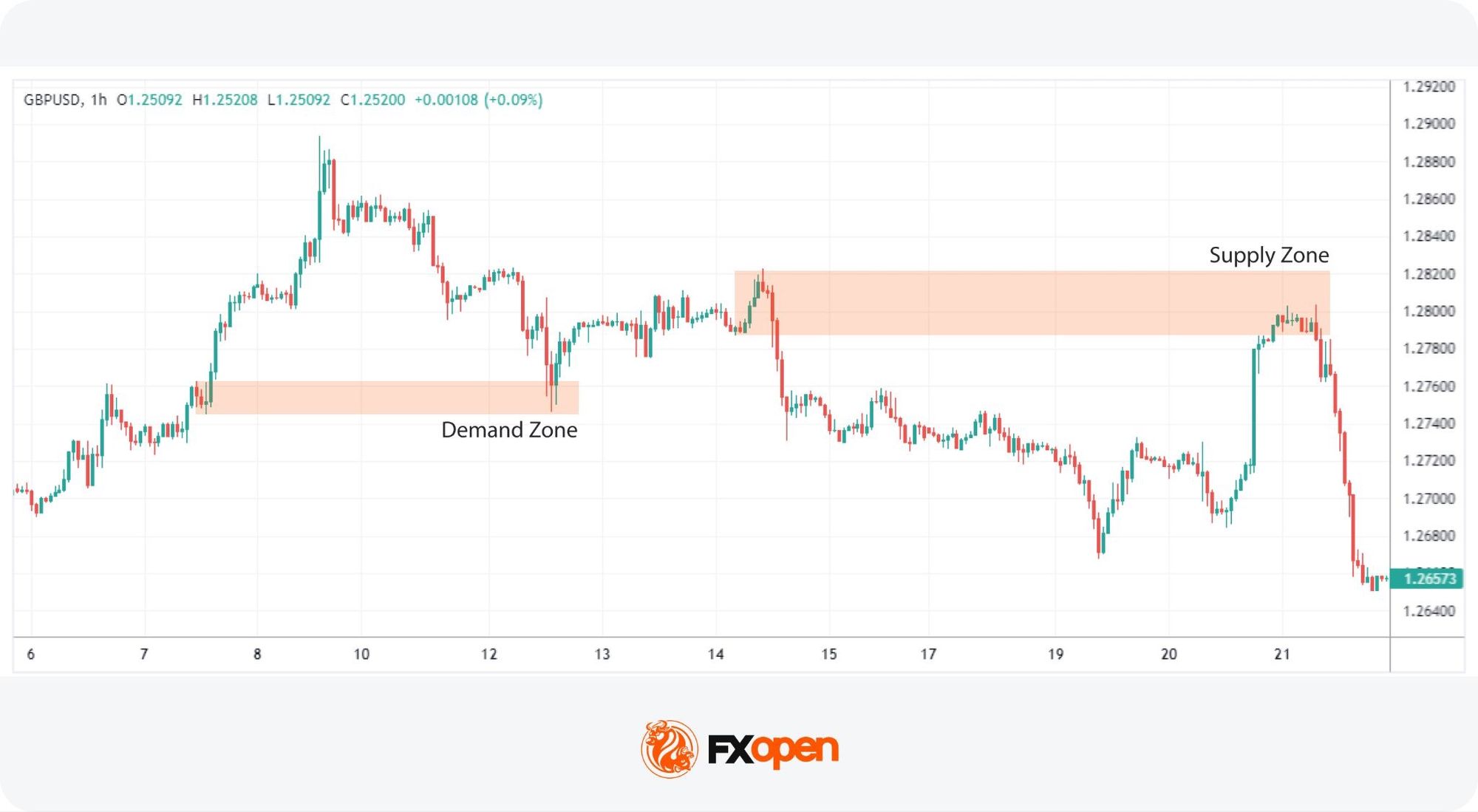
Trading supply and demand zones involves understanding their potential role as areas of support (demand) or resistance (supply). In an established trend, these zones are formed from bases—periods of consolidation—that, once the price breaks out and moves in a consistent direction, are likely to act as areas of support or resistance in return.
Supply and demand trading differs from traditional support and resistance analysis in one core respect. Support and resistance levels are drawn where price has reacted repeatedly over time. Zones, by contrast, are marked where a single decisive move occurred, signalling that one side of the market overwhelmed the other. The distinction shapes how traders read context around each area.
Both concepts mark areas of interest on a chart, but they describe different market behaviours. Supply and demand vs support and resistance comes down to what created the level. Zones reflect imbalance and active participation from one side of the market, often tied to institutional order flow. Support and resistance levels reflect repeated price reactions at a level over time, built from market memory rather than a single decisive move.
Feature | Supply and Demand | Support and Resistance |
Focus | Zones where price moved aggressively, reflecting imbalance and participation | Levels where price repeatedly stalled or reversed |
Structure | Defined areas with depth, built from bases and expansions | Single price levels or narrow bands |
Context | Tied to participation and liquidity shifts. | Tied to historical price memory. |
Usage | Analysing reactions, pullbacks, and invalidation | Marking reaction points and range boundaries |
Zone analysis carries more weight when the wider market context is factored in. The same zone can behave differently depending on the prevailing trend, the active trading session, and current volatility. Zones forming with the higher-timeframe trend tend to react more reliably than those that go against it.
Session timing matters in forex, where London and New York hours often produce the cleanest moves through zones, while Asian session ranges can compress reactions. Volatility regime shifts the equation too, as zones in high-volatility conditions often produce sharper reactions.
Higher-timeframe zones, drawn on the daily or weekly chart, tend to define the structural backdrop. These areas often hold institutional positioning and act as reference points for major reactions. Traders typically map these first, then look for confluence with current trend direction before considering trades.
Intraday execution context comes from lower timeframes such as the one-hour or fifteen-minute chart. These zones offer precision for entries and tighter invalidation, but they tend to fail when traded in isolation. Combining a higher-timeframe zone with a lower-timeframe reaction gives a clearer read on participation and reduces noise from session-driven moves.
Traders spot supply and demand zones by studying how price behaved before sharp expansions or breakdowns. The emphasis is on context and sequencing rather than drawing levels after the fact. What matters is how price leaves an area, not how long it sits there.
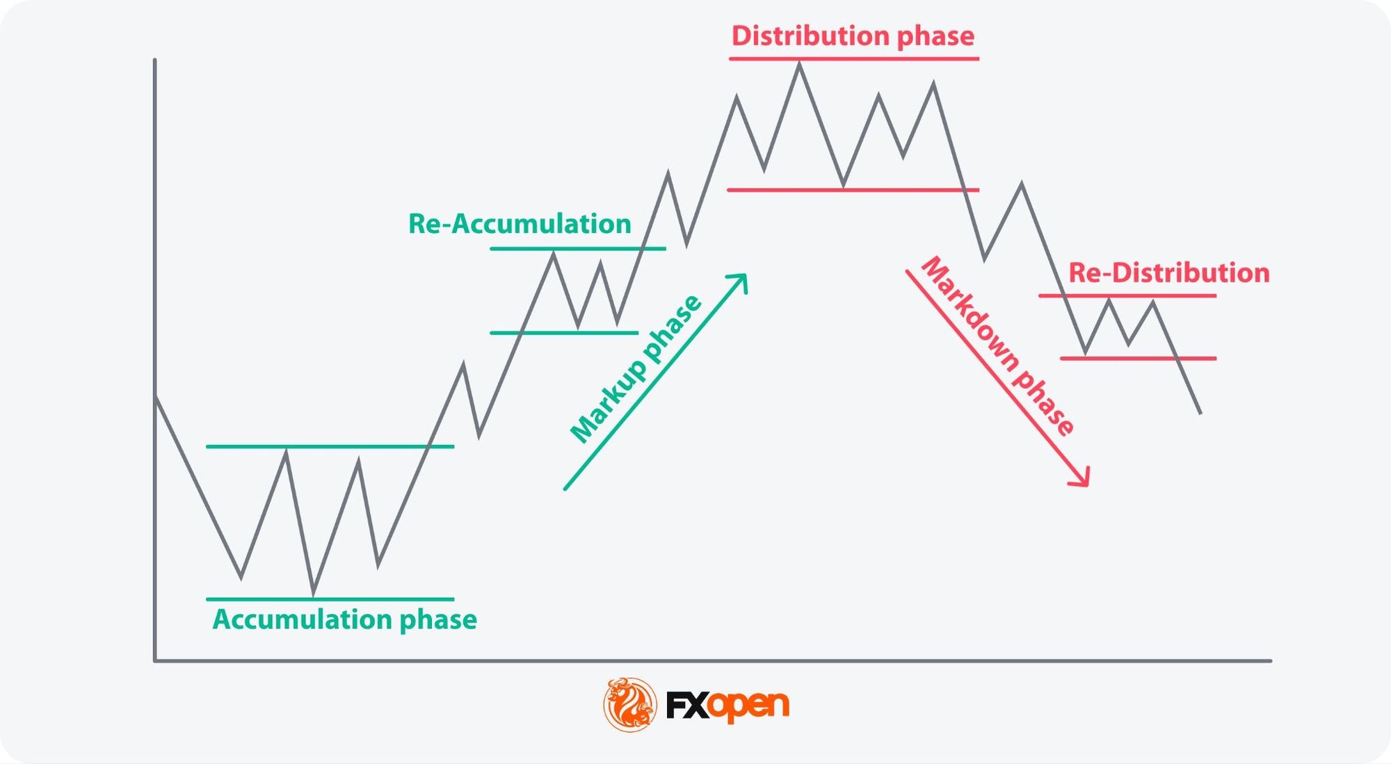
Accumulation and distribution are critical in understanding how supply and demand zones form and behave in financial markets. These terms describe the actions taken by influential market players—often large institutional investors or "smart money"—as they prepare for a potential price movement. They form a key component of Wyckoff trading.
The link between these phases and zones is direct. Accumulation produces demand zones, where institutional buying establishes the base from which price later expands upward. Distribution produces supply zones, where institutional selling creates the area price moves down from.
Accumulation occurs when these entities begin to buy or "accumulate" a long position over a period, typically at lower levels. This phase is generally not accompanied by a notable price increase, as the buying is done gradually to avoid significant movements that could attract attention. The end of an accumulation phase is often marked by a reaccumulation, where buying resumes after a brief rally and pullback/consolidation, further establishing a demand zone.
Distribution reflects the opposite scenario, where large holders begin to sell their holdings, usually after a rise. This selling does not immediately lead to a drop; it happens subtly to prevent a drastic decrease in price. Following a distribution phase, a redistribution might occur where selling continues after a minor rally or consolidation—this process may help solidify a supply zone.
Recognising specific patterns in supply and demand zones can assist traders in determining potential market movements. These patterns, derived from price action and the behaviour of market participants, provide visual cues on charts that suggest future trajectories. Here are four important patterns, which are explained in Frank Miller’s Supply & Demand Trading: How to Master the Trading Zones.
Supply and demand patterns fall into two broad categories. Continuation patterns extend the existing trend, while reversal patterns mark a shift in direction.
This pattern is a bullish indicator and occurs as the price leaves an accumulation/demand zone. The sequence starts with a rally, where there is a noticeable upward movement. This is followed by a base, a period where prices consolidate within a relatively narrow range, indicating a balance between buyers and sellers. The pattern completes with another rally, suggesting that demand has overwhelmed supply, pushing prices higher. RBR is generally classified as a continuation pattern, as it reflects the market pausing within an existing bullish move before the uptrend resumes. The pattern reinforces an existing demand zone.
Recognising the Rally-Base-Rally pattern can signal traders to consider a long position as the market sentiment will likely continue upward.
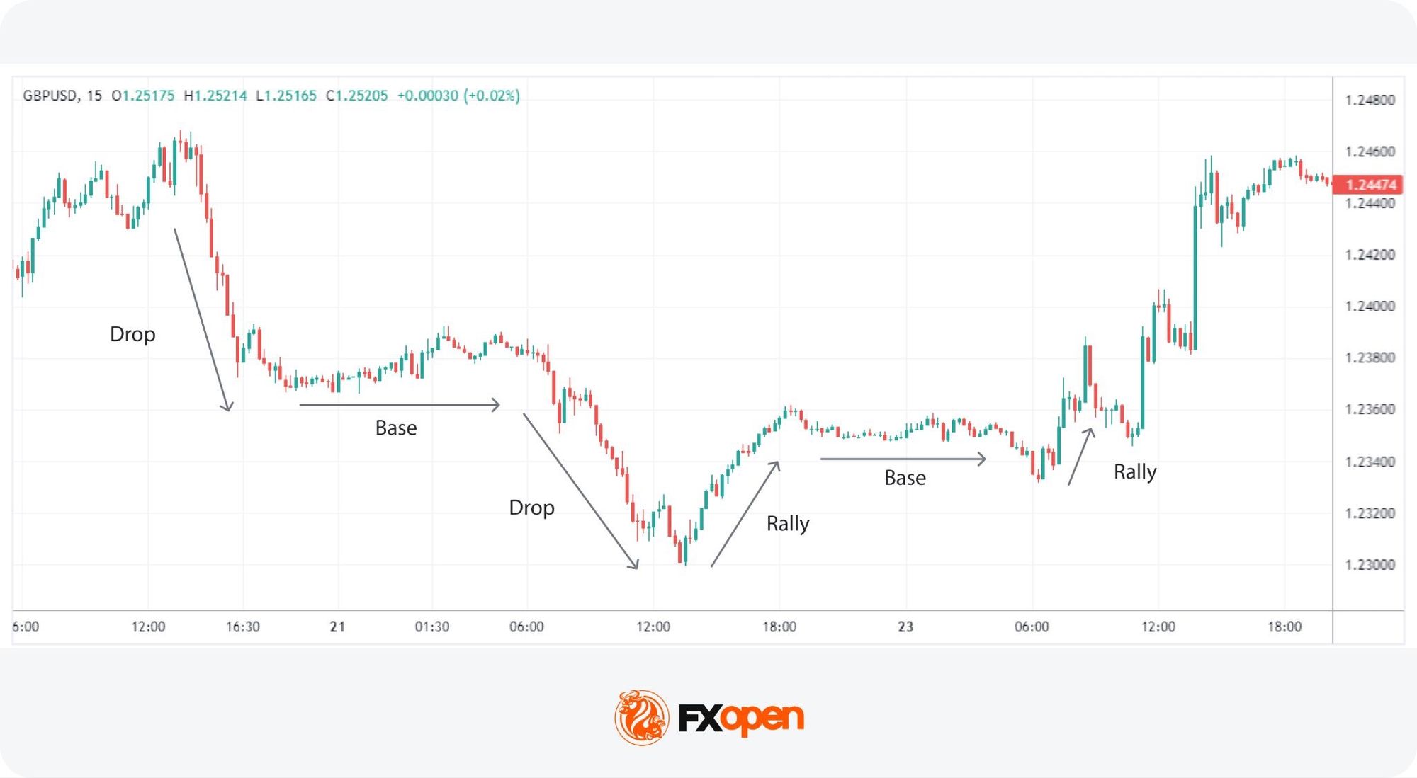
Mirroring the RBR, the Drop-Base-Drop pattern is a bearish formation found after an effective distribution from a supply zone. It begins with a drop, indicating strong selling pressure. The base phase occurs next, where the price moves sideways briefly, showing uncertainty or equal force from buyers and sellers. A subsequent drop follows, demonstrating renewed selling pressure and an overpowering supply. DBD is a continuation pattern that forms within an existing trend and reinforces its strength after a pause. The pattern enhances an existing support zone.
As the price leaves the base, traders may consider it as an entry for a short position.
The Rally-Base-Drop pattern typically signals the formation of a supply zone and is indicative of a bearish reversal. It starts with a rally, where buyers temporarily gain control. However, this rally is short-lived and leads into a base phase—a period of consolidation. The critical phase is the subsequent drop, where sellers dominate, reversing the initial upward trend. It’s a reversal pattern that marks the creation of a fresh supply zone and appears when the trend changes its direction.
This pattern is particularly valuable for traders looking to capture the shift from a bullish to a bearish market.
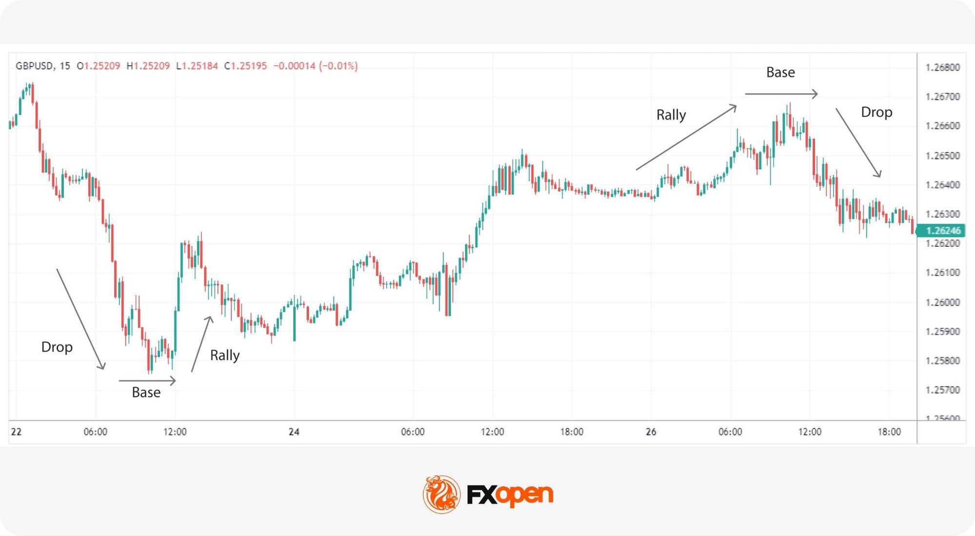
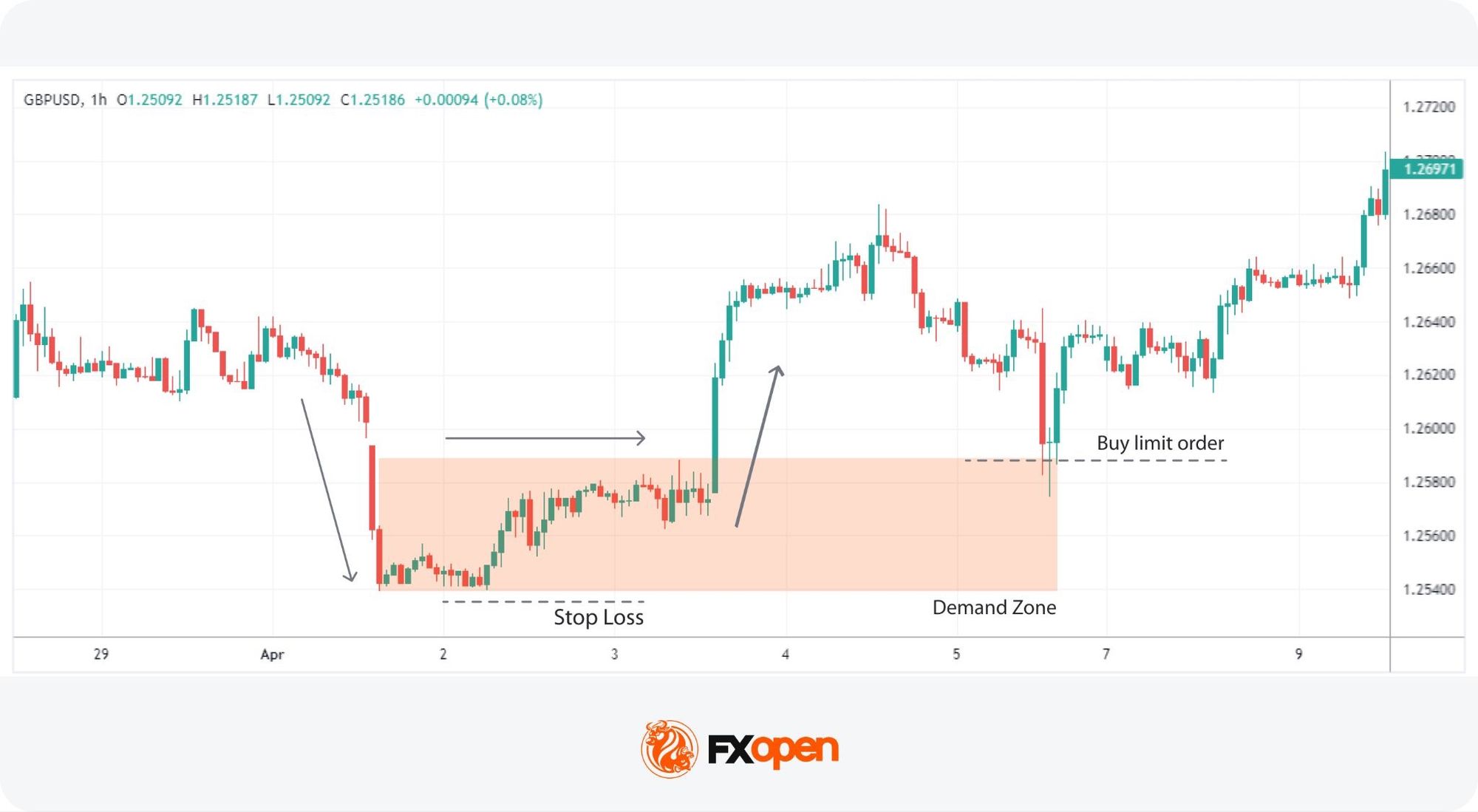
Contrary to RBD, the Drop-Base-Rally pattern indicates a bullish reversal and creates a demand zone. It starts with an initial drop, reflecting strong selling. This phase is followed by a base, where the market finds equilibrium and the selling pressure begins to wane. The final phase is a rally, suggesting that buyers have regained control and are likely to push prices higher. It’s a reversal pattern that marks the creation of a fresh demand zone.
This pattern aids traders in spotting potential entry points for long positions as the market sentiment shifts from bearish to bullish.
To try spotting these patterns for yourself, you can consider heading over to FXOpen’s TickTrader platform to access real-time charts with over 1,200 analysis tools.
Supply and demand strategies are centred around the identification and reaction to key levels that indicate underlying shifts in market sentiment. Traders often focus on how price exits these zones to gauge potential continuation or reversal of trends. Let’s have a look at supply and demand trading examples.
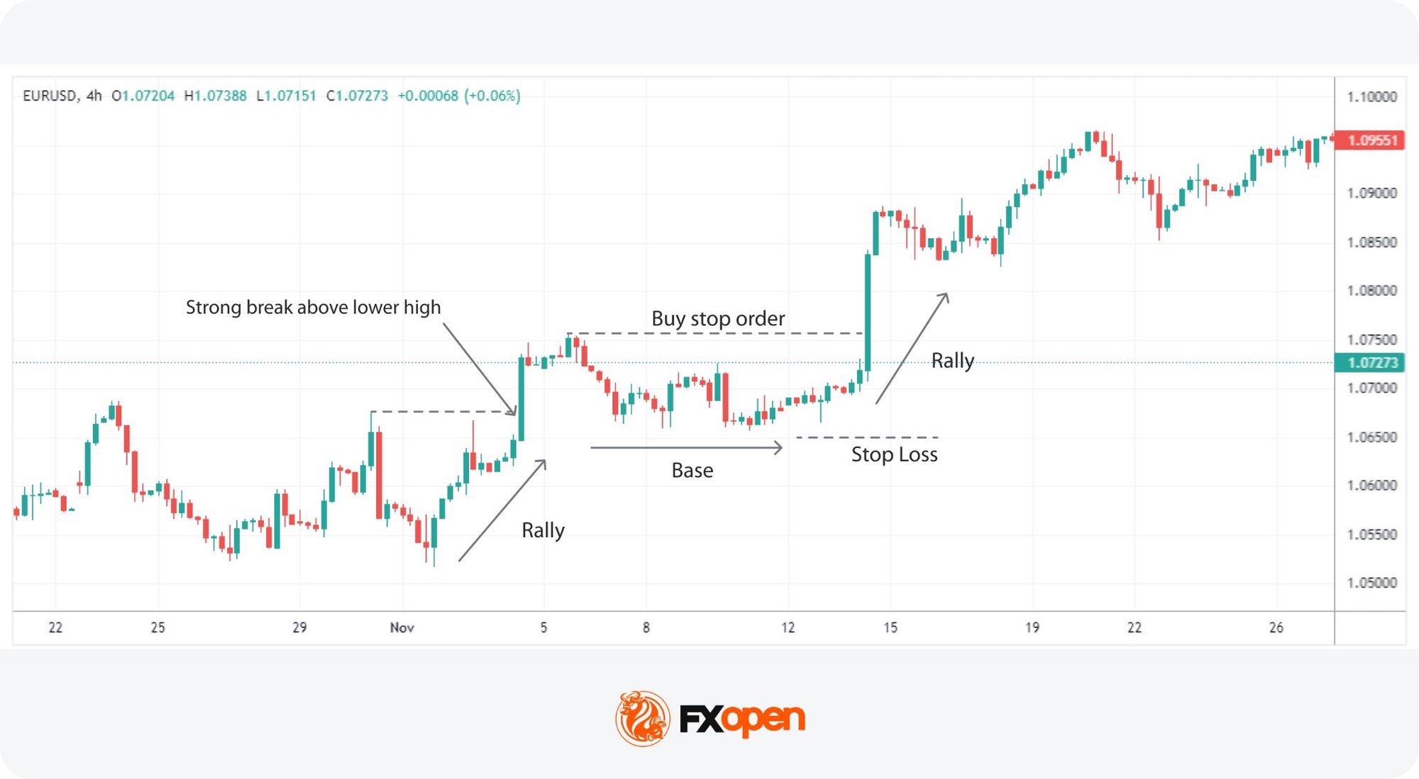
This Drop-Base-Drop/Rally-Base-Rally strategy capitalises on the formation of a base after a distinct move that often breaks an established trend, i.e. moving sharply above a lower high in a downtrend or higher low in an uptrend.
Traders look to this pattern as it leverages the momentum generated from a strong initial move (rally or drop) followed by a stabilisation period (base) that offers a clear breakout point, indicating a potential trend continuation.
This approach focuses on reversal patterns forming in established supply or demand zones, offering insights into potential trend shifts. It utilises the inherent strength of existing supply or demand zones, coupled with a clear reversal pattern, to identify high-probability trades in line with the trend's direction.
Even traders who understand the framework run into recurring errors. Most stem from drawing zones too liberally, ignoring wider context, or treating heavily tested areas as if they still hold institutional interest.
Drawing too many zones close together clutters the chart and dilutes meaning. Traders typically focus on a smaller number of clean, well-defined areas where the impulse move and base are clearly visible.
Treating zones in isolation from the broader trend, news flow, or session timing tends to produce inconsistent results. A demand zone in a strong downtrend behaves differently from one aligned with an uptrend.
Each retest absorbs unfilled orders that originally created the imbalance. By the third or fourth touch, a zone is often hollowed out and behaves more like ordinary support or resistance.
Supply and demand analysis offers a structured way of reading price, but it is not without trade-offs. Understanding where it adds clarity, and where it can mislead, keeps expectations grounded.
Supply and demand zones and their related patterns can support market analysis across various asset types, including forex, stocks, commodities, and cryptocurrencies*. In practice, this approach centres on reading context, timing reactions, and managing invalidation rather than searching for certainty. Over time, repeated exposure to these zones may support a more consistent way of framing price behaviour across markets.
If you’d like to put theory into practice, you can consider opening an FXOpen account to access a wide range of instruments at competitive trading conditions.
Supply and demand zones in forex trading are areas on a chart where a sharp price move originated from order flow imbalance. Demand zones form where buying overwhelmed selling, producing an upward expansion. Supply zones form where selling overwhelmed buying, producing a downward expansion.These zones are used to identify potential areas where the price might either stall or reverse based on past trading activity.
A strong zone tends to show a fast, clean move away from a compact base, with large candles and minimal overlap. Fewer prior retests, alignment with the higher-timeframe trend, and formation near structural highs or lows also tend to mark zones that carry more weight in subsequent reactions.
Supply and demand zones reflect imbalance, drawn as ranges where one decisive move occurred. Support and resistance reflect repeated reactions over time, drawn as levels or narrow bands. Zones tend to weaken after one or two retests, while support and resistance can hold across multiple touches before breaking.
Yes. Zones can fail when price moves through them without a meaningful reaction. This happens more often in news-driven conditions, when zones counter the broader trend, when the area has been heavily retested, or when liquidity conditions shift. Failed zones tend to produce extension moves rather than reversals.
Daily and weekly timeframes tend to define structural zones with stronger institutional context. One-hour and fifteen-minute timeframes suit intraday execution and offer tighter invalidation. Many traders combine the two, using higher-timeframe zones to set direction and lower-timeframe zones to refine entry points.
The four stages of the market cycle include Accumulation, Markup, Distribution, and Markdown. These stages describe the systematic process of price movement in markets, from periods where smart money accumulates positions to phases where these positions are distributed, leading to price declines.
*Important: At FXOpen UK, Cryptocurrency trading via CFDs is only available to our Professional clients. They are not available for trading by Retail clients. To find out more information about how this may affect you, please get in touch with our team.