
The diamond chart pattern is a technical analysis formation that appears on price charts after a strong trend and often signals a trend reversal. The structure consists of a broadening phase (higher highs and lower lows) followed by a contracting phase (lower highs and higher lows), creating a shape that resembles a diamond. Traders analyse this pattern to identify trend exhaustion, breakout levels, and possible changes in market direction.
This article explains the structure of the diamond chart pattern, the market psychology behind it, and how to trade the diamond pattern.
The diamond pattern is a technical analysis formation that develops after a strong trend and often signals a potential market reversal. It forms when price movements first create higher highs and lower lows, producing a broadening structure, and then shift to lower highs and higher lows, creating a contracting structure. Together these movements form a diamond-shaped pattern on the chart.
The diamond pattern can be either bearish or bullish, and it is also known as the diamond top pattern and diamond bottom pattern for trading. Both formations share the same structural characteristics but occur in different market conditions and signal different potential outcomes.
Type | Market Context | Breakout Direction | Possible Signal |
Diamond Top Pattern | Forms after an uptrend | Below the lower boundary | Potential bearish reversal |
Diamond Bottom Pattern | Forms after a downtrend | Above the upper boundary | Potential bullish reversal |
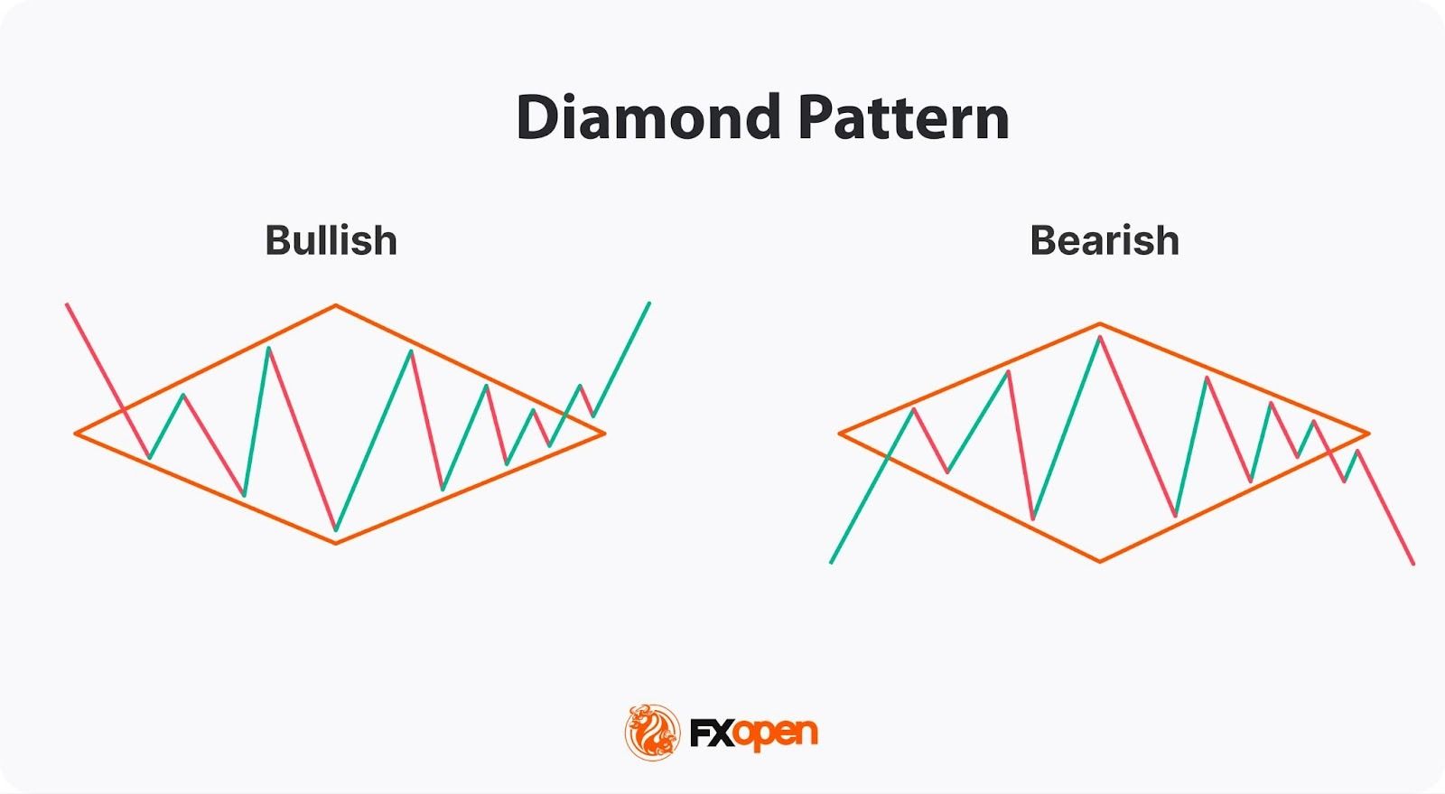
The diamond pattern in trading reflects a gradual shift in market sentiment. During the expansion phase, price swings become wider as buyers and sellers compete for control of the market. This stage often reflects uncertainty and heightened volatility.
As the formation progresses, volatility begins to contract. Price movements become narrower, suggesting that the market is moving towards a new balance between supply and demand.
The eventual breakout from the pattern typically represents a decisive shift in control. If buyers dominate, the price may break upward. If sellers take control, the breakout may occur to the downside. For this reason, traders often analyse the diamond pattern as a signal of potential trend exhaustion and a possible change in market direction.
The diamond pattern has a distinctive but relatively straightforward structure. Traders follow certain steps to spot it on the chart.
The diamond chart pattern is less common than formations such as triangles or head and shoulders. However, it can precede significant price movements. Research by technical analyst Thomas Bulkowski shows that diamond bottom patterns break upward about 73–74% of the time, with an average rise of roughly 35–39% after the breakout. Diamond top patterns break downward about 54% of the time, with an average decline of around 17%.
Like most chart patterns, this formation has particular rules traders can use to build their own trading strategies. These rules can be applied to the diamond pattern in forex, stock, commodity, and cryptocurrency* markets.
Traders typically buy after the price breaks above the upper boundary of the pattern and sell after the price falls below the lower boundary.
The breakout signals a potential trend reversal.
Traders use several confirmation tools. The first one is rising trading volume. The breakout should be accompanied by an increase in trading volume. Low trading volumes usually signal a false breakout, whereby the price returns to its previous trend. Fakeouts can be caused by market volatility, news events, or other factors that disrupt its validity.
The second tool is multiple timeframe analysis. For example, if a diamond is forming on the hourly chart, traders may look at higher timeframes, such as the 4-hour or daily chart. If the breakout aligns with the trend on multiple timeframes, it may provide a stronger trading signal.
The take-profit target typically equals the width of the diamond setup. Traders measure the vertical distance between the highest high and the lowest low and add that distance to the breakout point in the bullish formation or subtract this distance from the breakout point in the bearish formation.
Traders typically place stop-loss orders just beyond the level opposite to the breakout. Another approach is to place stop loss beyond the apex, which is the highest point in a diamond top pattern or the lowest point in a diamond bottom pattern.
Although the diamond is primarily considered a reversal formation, it can also indicate the continuation of an existing trend. Traders can see it appearing within the context of a strong trend and interpret it as a pause before it resumes.
In the case of a diamond continuation pattern, traders go short on the breakout of the lower trendline of the diamond and go long on the breakout of its upper trendline. Still, the profit target and stop-loss point will be calculated similarly to the reversal formation.
To confirm the diamond formation, traders often rely on a combination of technical indicators and fundamental analysis. These tools provide additional layers of validation and may help filter out false signals.
The diamond formation can be used in various trading strategies. Here are some common approaches that traders can utilise.
One of the most straightforward strategies with the diamond setup is to trade breakouts.
Entry: Traders enter the market in the breakout direction. They wait for the price to break above the upper trendline in a diamond bottom formation or below the lower trendline in a diamond top trading pattern.
Stop loss: Traders usually place a stop-loss order below the lower line in a bullish formation or above the upper line in a bearish formation. Another option is to consider the risk-reward ratio of 1:2 or 1:3.
Take profit: The most common approach is to measure the difference between the diamond's highest high and lowest low. This distance is added to the breakout point for a bullish breakout and subtracted from the breakout point for a bearish breakout. If traders trade in a solid trend, a take-profit target can be trailed.
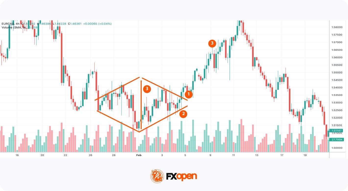
In the chart above, a bullish diamond formed after a prolonged downtrend. The price broke above the upper line (1). The volumes on the breakout increased significantly, so a trader could have expected bulls to push the price higher. A trader could have placed a stop-loss level below the lower line (2). After that, a trader could have measured the distance between the highest and the lowest points and added this to the breakout point (3). The bullish trend was strong, so a trader could have trailed that take-profit target.
Another strategy is to look for price retracements.
Entry: Traders wait for the price to retest the broken trendline and then enter a trade in the breakout direction. In this approach, traders usually use a limit order.
Stop loss: Stop loss is placed below the retracement level in the bullish pattern and above the retracement level in case of a bearish setup.
Take profit: A profit target is calculated based on the distance between the highest and lowest points. The distance is added to the breakout point in the bullish formation or subtracted from the breakout point in a bearish formation.
Trailing stop-loss and take-profit orders can be applied to this approach.
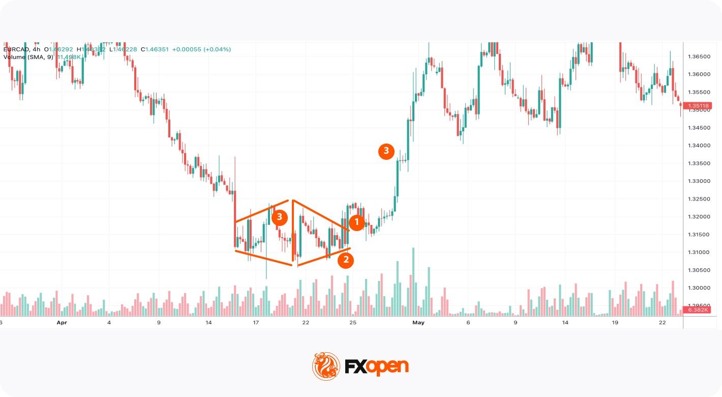
In the chart above, a diamond bottom pattern was formed. The price broke above the formation's upper line, but it retested it later (1). A trader could have placed a buy limit order at the upper line. A stop-loss could have been placed below the lower line (2), while a take-profit target could have equalled the distance between the highest and lowest points of the formation (3).
This strategy may support traders in catching potential trend reversals. However, there is a risk of a missing trade as the price may keep moving in a breakout direction without a retracement.
If you want to practice these trading approaches, you may consider opening an account on FXOpen’s TickTrader trading platform and access numerous technical analysis tools and assets.
The diamond formation is commonly compared to the head and shoulders setup. However, they have different trading rules; therefore, it’s vital to learn how to distinguish between them.
The head and shoulders formation consists of three peaks, with the middle peak (the head) being higher than the other two peaks (the shoulders) and is formed at the end of an uptrend. The inverse head and shoulders pattern consists of three troughs, with the middle one being lower (head) than the other two troughs, and it appears at the end of a downtrend.
The diamond, on the other hand, is characterised by a series of higher highs and lower lows which turn into lower highs and higher lows.
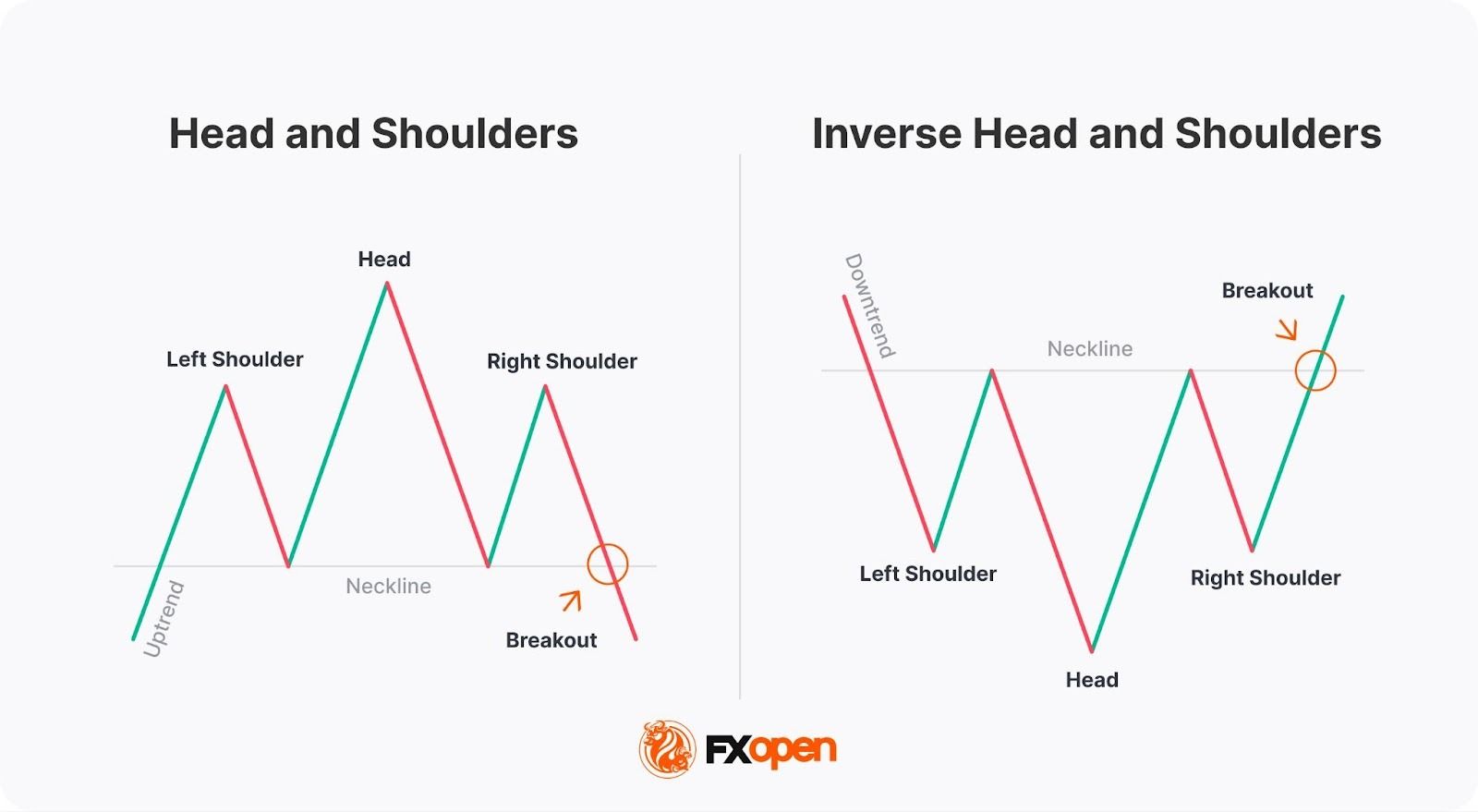
When trading the (inverse) head and shoulders setup, traders measure the distance between the head and the neckline (the line drawn through troughs in the head and shoulders and through peaks in the inverse head and shoulders) and add it to the breakout point.
The diamond holds value in technical analysis due to its unique shape and ability to reflect future price reversals.
It represents a period of indecision in the market where neither buyers nor sellers dominate. This indecision is marked by a series of higher highs and lower lows that eventually narrow into a symmetrical structure resembling a diamond.
Although it is not the most common pattern, when it does appear, it often precedes significant market moves. However, traders should be aware that the reliability of its signals varies depending on many factors, including market conditions, volume, and external factors.
The distinctive structure of a diamond may provide several advantages when assessing price behaviour on financial charts.
While the diamond can be a valuable tool, it has limitations.
Traders often focus on confirmation signals and overall market context rather than relying on the pattern alone. Applying a structured approach may help improve the quality of trade decisions.
The diamond chart pattern is a distinctive technical analysis formation that may signal trend reversals after strong price movements. Although it appears less frequently than other chart formations, its structure can provide valuable information about market indecision, volatility shifts, and potential breakout points. Traders typically combine it with volume analysis, support and resistance levels, and broader market context.
If you want to apply the diamond pattern in real trading, you may consider opening an FXOpen account to access over 700 markets and trade with low commissions from $1.50 and tight spreads from 0.0 pips.
Traders identify a diamond chart formation by observing price movements that first expand and then contract, forming a diamond-shaped structure on the chart. The formation is typically outlined using four trendlines connecting higher highs, lower lows, lower highs, and higher lows. A confirmed breakout from the pattern often signals a potential change in trend direction.
A diamond chart formation can be either bullish or bearish depending on where it forms in the market trend. A diamond bottom pattern develops after a downtrend and may signal a potential bullish reversal. A diamond top pattern appears after an uptrend and may indicate a possible shift to a bearish trend.
Trading a diamond typically involves waiting for a breakout from the formation. Traders often enter a position in the direction of the breakout and place stop-loss orders beyond the opposite side of the formation. The potential price target is often estimated using the vertical distance between the highest and lowest points of the formation.
*Important: At FXOpen UK, Cryptocurrency trading via CFDs is only available to our Professional clients. They are not available for trading by Retail clients. To find out more information about how this may affect you, please get in touch with our team.